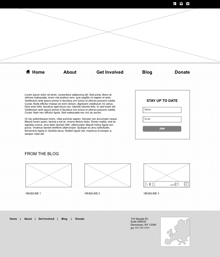
In our last post, we explored the topic of site mapping, the first step in our three-part series on laying the foundation for an effective nonprofit website. Once you’ve finalized your site map, you’re ready to begin the process of wireframing. This is where you’ll make decisions about individual page elements and where they should appear on the screen. It’s important to remember that even though you’ll be working on page layouts, it’s not yet time to begin the process of styling these elements. In fact, the most effective wireframes will be devoid of color, images and font selections, like the one pictured here. While your sitemap gives you a good bird’s-eye view of the site, your wireframes will provide you with a page-by-page architecture or blueprint, allowing you to consider user interactions on each page.
 While you might be tempted to skip this step altogether and move on to the look and feel of your website, wireframing is a crucial step in the process for two reasons. First, a wireframe allows you to focus on functionality. Before you make decisions about how anything should look, you’ll need to consider the user story, or what users should be able to do once they arrive on your site. Do you want them to call you? Do you want them to subscribe to your newsletter? Do you want them to make a donation? Whatever actions you want them to take will need to be addressed in your wireframes. That said, you’ll need to consider where and how to incorporate these functions into your site. You’ll also want to use this opportunity to consider what type of priority to give to each of these functions. This can be determined by the placement and size of these features on the page.
Next, a wireframe forces you to consider usability. Without getting caught up in the more subjective discussions about the colors or shading for each element, you’ll be able to determine the best placement and priority of specific content or calls to action to direct visitors where you want them to go. Even if you don’t have all of your content completed yet, it’s a good idea to define what messages will be used and where these will be placed. Once you’ve defined what you want users to do, you need to consider the most intuitive way to direct them to do it. Maybe that means your donate button should take up a little more real estate. Maybe that means you need to re-think how many fields appear on your newsletter subscription form. Or maybe, you’ll want to move some of your content a little lower on the page so the action items are closer to the top of the screen. The key to creating a user-friendly wireframe is to consider the needs of your audience and how to meet these needs in the most intuitive way possible.
Whether you’re using a pen and paper or a more sophisticated piece of software to create your wireframes, the goal remains the same. You need to first determine the functions of your website, and then organize and prioritize these elements in the most intuitive way possible. If you’re looking for a tool that will allow you to build a wireframe with a web-based application, one great option is pidoco.com.This tool has a minimal monthly fee for a limited number of projects, and it allows you to design and connect countless pages within your project. If you’re looking for a tool you can download and use on your computer, Pencil offers the basic functionality you would need to design a wireframe for a simple site. A more comprehensive list of wireframing tools can also be found here.
